Like fashion trends, mobile app design trends never stay the same. But, of course, just like 20-x style is coming back in fashion, so apps might still borrow design styles from the past but don’t forget that they are giving it a modern twist.
Especially when we see a lot of new mobile apps being released every year, based on research, revenue from mobile apps is projected at a whopping $808 billion in 2022.
So, in this article, our design team has collected 4 mobile App design trends 2022 that will help you stay up to date. You can select trends that will be perfect for your business and needs because each business is unique and has specific features or restrictions on design to use.
#1 App trend: turn on a dark mode
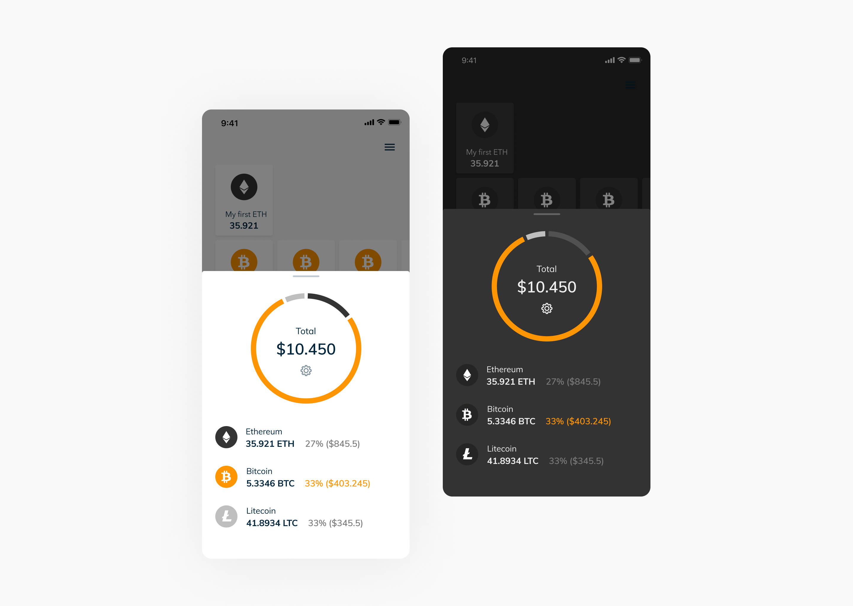
This feature became famous in 2019. But at first, dark themes were only used as a feature to be used at night to relieve eye strain while using the app. Today many apps have already adopted this trend, and even mobile operating systems iOS and Android support developers anticipating dark mode for their apps by providing guidelines.
You can add special features to make your app more attractive with dark mode. Take a look at the example below. When our client wanted a dark mode, we said, “no problem.” The bright combination of blue and black is simple and engaging. The colors contrast just enough so that everything is easy to read.

#2 App trend: limitless imagery
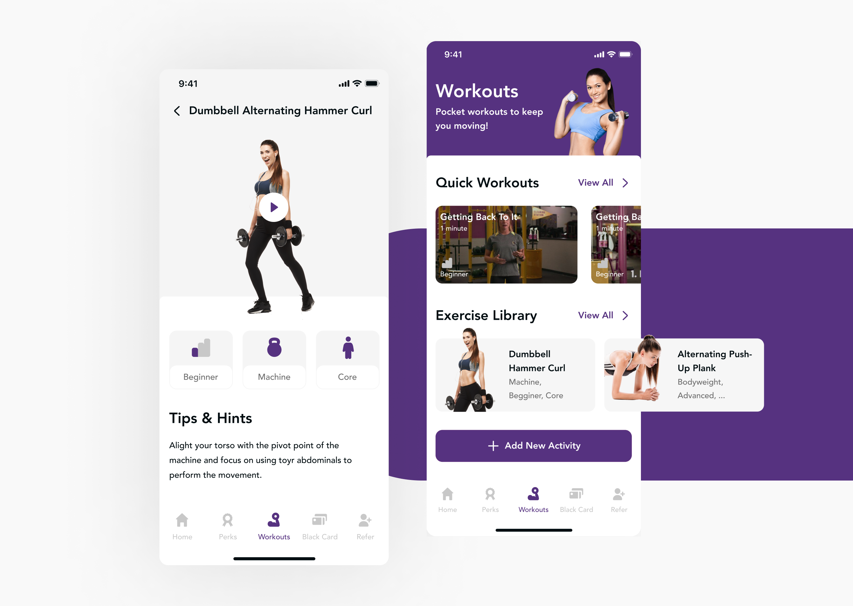
Limitless imagery uses a new formula that breaks away from the borders of traditional apps. It’s a trend that will continue to become popular in the coming years so we think you should be familiar with it.
Using this trend, products no longer need to be contained within a rectangle or square. Instead, they appear boundless and merge with the background as if they’re floating amongst other design elements. Probably you’ve already noticed this trend on Dribbble and Behance. It offers a more cohesive experience using any app and unifies the design.
One example of this trend from our portfolio is Planet Fitness App Redesign Concept. During the pandemic, the demand for effective and attractive fitness apps with different functionality is the need of the hour!

#3 App trend: multi-directional navigation
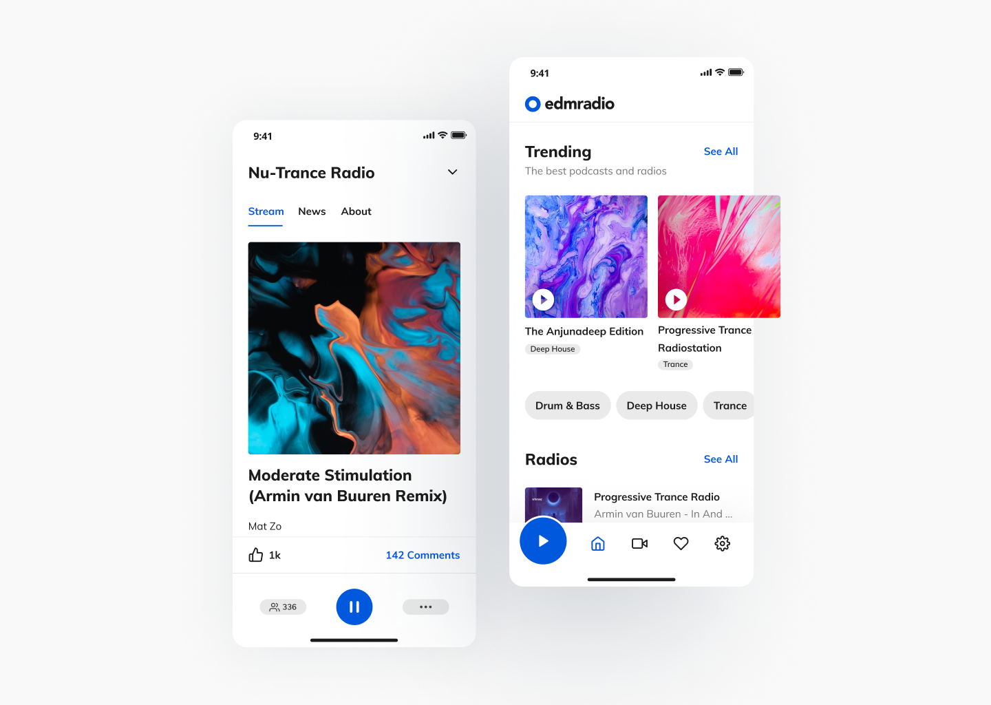
Multi-directional navigation is a new intuitive trend to simplify complex interactions in apps. This way, users don’t need to scroll up and down through features. Multi-directional navigation allows users to interact with apps more effectively and consciously because horizontal sliders amidst vertical scrolling displays create a more interactive and intuitive user journey.
This trend is especially relevant for radio, music apps, those featuring podcasts, or social media. So, we used multi-directional navigation during redesigning one of our in-house projects, edmradio. Edmradio – is a unique and new streaming music service and community for people who love EDM music the same as we are. 
#4 App trend: More Gradients and Shadows
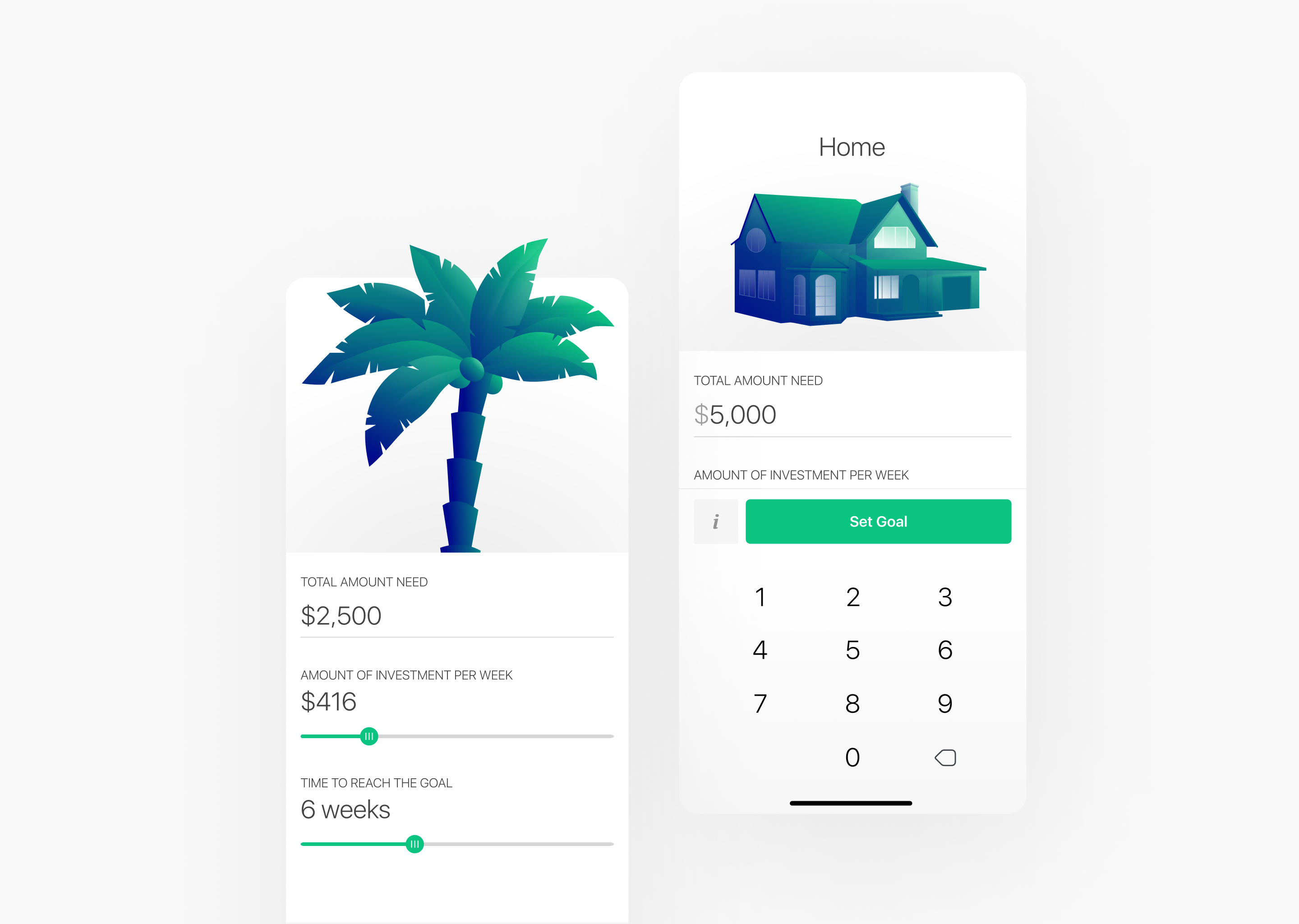
Gradients have been a trend in logo design and web design in 2020-2021, but it’s only now gradient backgrounds have become popular in mobile app design. And we know the reasons why. Gradient backgrounds are a great way to create depth and draw attention to some design aspects.
Also, some designers use additional effects, such as transparency and pattern overlays, to create unique user experiences.
If talking about shadows, this effect is often used to bring depth to UI elements, make them appear 3, and give elements a sense of weight. Users love seeing depth on their screens.
Companies should pay attention to this design trend to offer a better user experience while keeping their app compatible with older devices.

To sum up:
Remember the rule – appearance shouldn’t argue with functionality. A good designer must consider what can be done in an app to make it intuitive and functional. As a design & development agency, we never make a design that doesn’t apply to reality.
And, of course, you need to create a design based on your audience’s needs and preferences. For example, the dark mode won’t be great on an app for kids.
Remember, as we told you in the beginning, design constantly changes. But the meaning of design stays the same.
Do you need to update your app design? Or create an app with an excellent design from scratch? Then, contact us — and let our professional team prepare your brand for 2022.