Because of the COVID-19, most dispensaries switched to the delivery of goods, rather than selling directly in the stores, the question arose about the convenience and website design. A customer coming to your site should understand where to click to order a product, how to do it, and which product is the best for him/her.
Overall situation
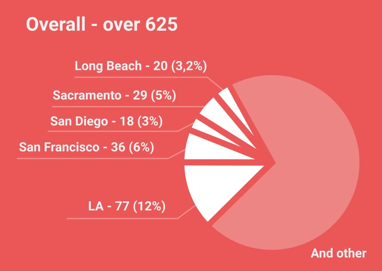
In California, the competition among dispensaries is vast. The state has approximately 625 stores and points of sale. And everyone is trying to stand out and be the best. Most positions are located in LA. As a result, dispensaries are looking for new ideas to offer their customers something special. It is a unique case when there is only one store in the city, and in any way, the buyer will order the goods in this place (if any). But, when there is a choice among 77 shops, it’s another deal.

To increase the profitability of your site, you need to make it understandable to the user. The site must have the following sections:
– Home page
– Contact Information
– Page with product catalogs (by category or all together)
– Product page
– Basket
– Terms of delivery, payment, warranty
– Checkout page
– Feedback Page
An excellent marketing move may be the availability of banners with discounts. This will attract the attention of buyers. You can also have a blog-section and posting here by posting the latest industry news.
Follow the trends
As for design, you need to adhere to the latest trends. It is worth paying attention to content and photos. They should be of high quality and eye-catching. Analyzing the Los Angeles dispensaries’ websites, we noticed that most of them use good images on their website with a white background. However, some do not think about quality and often use placeholders. This spoils the impression of the store.
One of the design trends of 2020 is minimalism. For an online store, this is what is needed so as not to confuse the buyer. Some sites will load the buyer with information that he does not need. There are also problems with displaying reviews. It all looks like an Amazon page. The only problem is that everyone knows the Amazon, and it is unlikely that buyers will refuse its services. But moving to another dispensary site won’t be difficult. When designing, you can use blue and purple gradient, add movement to the main page, combine bright colors, and make an unusual download page.
Adaptability
Another important aspect is the adaptability. We shouldn’t forget that most customers use a mobile phone when ordering. Therefore, it is worth paying great attention to the mobile version of your site. All this will help you attract the client’s attention, because if he likes your site, he won’t be looking for something else.
Problems website design
We picked up some typical errors found on the sites of LA dispensaries:
Not everywhere there are reviews (they are essential when the buyer cannot go to the store and look at the product but is based only on the site)
On some sites, there is no delivery (at the moment a vital function)
Not everywhere, the CBD to THC ratio is immediately written
Not all products have pictures
Not all sites have chat rooms with support
It is not always clear how to place an order
All these errors negatively affect the operation of the store and directly reduce customer loyalty. SweetcodeLad knows how to make your site more attractive. We have experience in the development and website design (this can be found in our portfolio). In work, we always rely on the latest design trends and make it tailored for the user. If you already have a site, we will be happy to make an adaptive version for it or correct those shortcomings.
